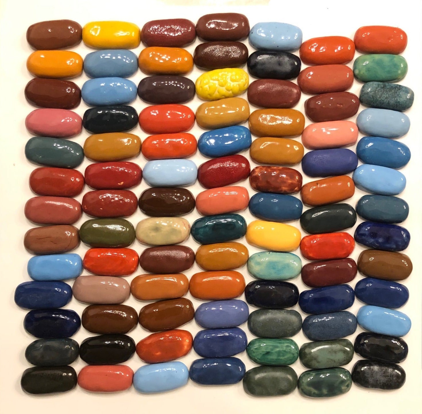
Collection:
Choosing colors
Color Theory
is the art and science of using color to create harmony and evoke emotion. It revolves around the color wheel, guiding me to combine hues effectively: complementary colors (opposites like blue and orange) create bold contrast, analogous colors (neighbors like green and blue) offer cohesion, and monochromatic schemes (shades of one color) ensure unity. Quality contrast uses a dominant vivid color to set the mood (e.g., deep blue for calm) paired with subtle accents (e.g., soft gold) to balance bold and muted tones, adding depth and hierarchy. By understanding how colors interact and influence perception—red for energy, blue for calm—I can craft visuals that resonate deeply, balancing aesthetics with intention to bring my creations to life.